BRAND

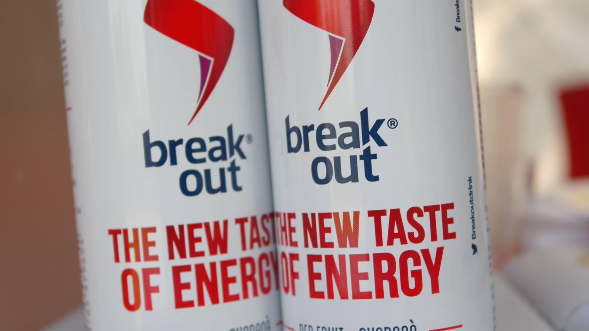
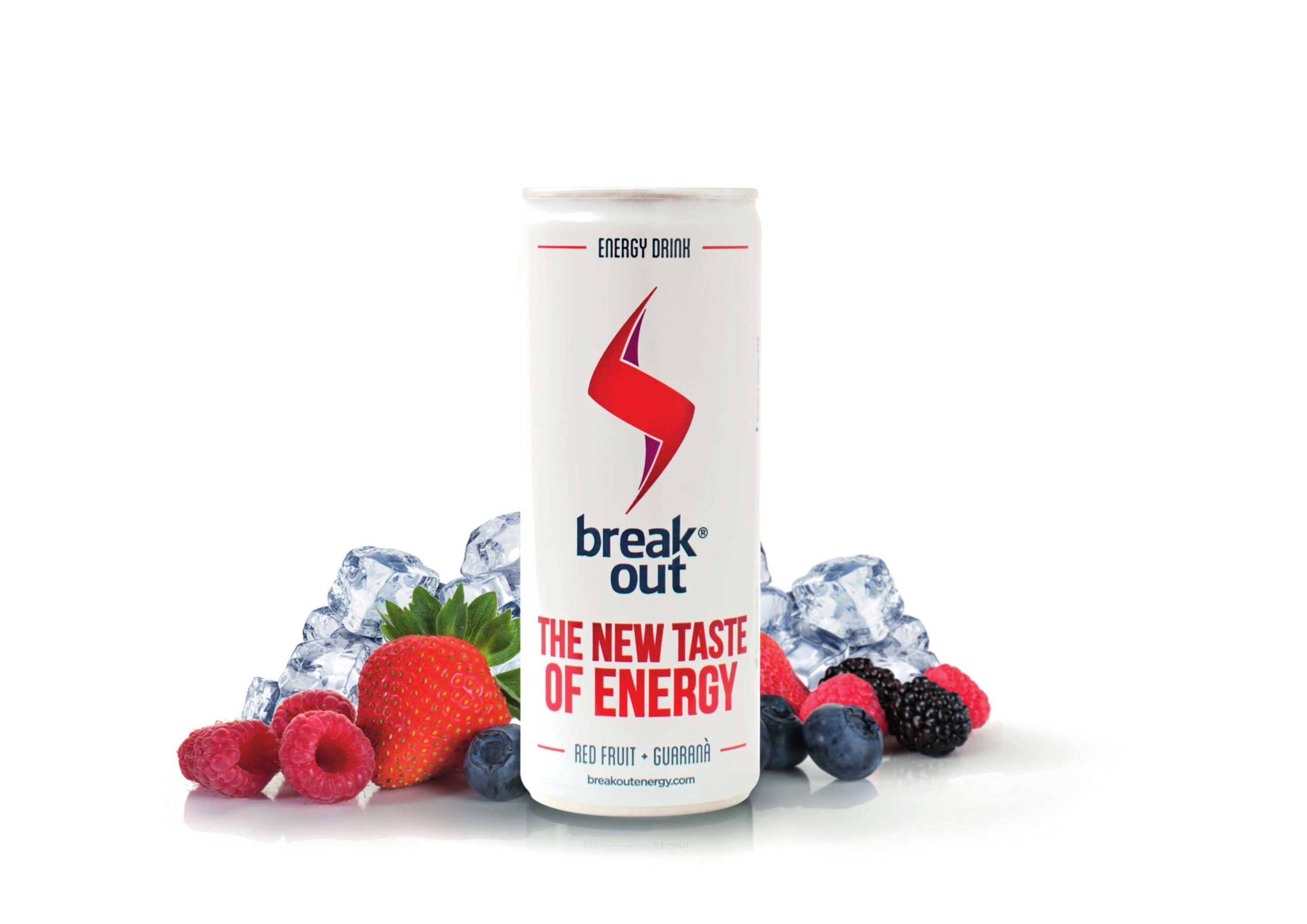
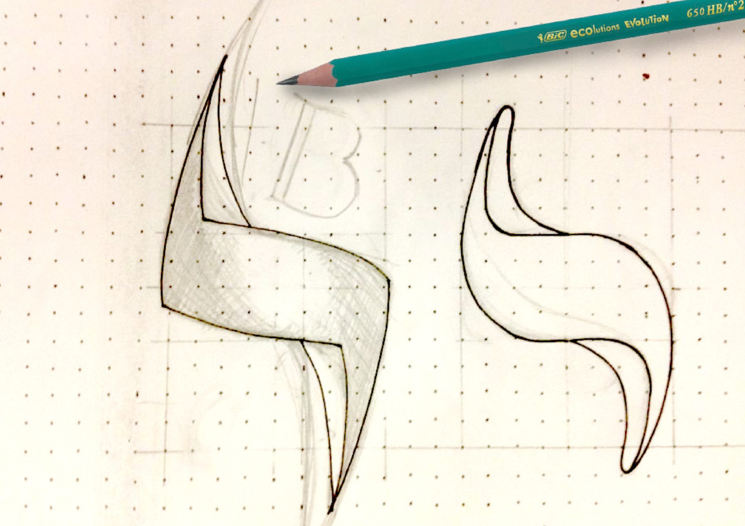
Break out is a new energy drink that differs from its competitors thanks to the presence of natural ingredients. Starting from the tea leaf, natural and main element of the product, we have a stylized lightning bolt, a symbol of energy and strength.

The choice of the colors bring the flavor of red fruits present in the drink. The graphic is composed of soft lines, which give idea of naturalness, and more marked lines that represent the concept of energy.

The concept of break, understood as a rupture, deadlift, pause…is represented by the stylization of the font in which we can see cuts creating a real logo type.

Very simple and recognizable is the full values is that the brand wants to communicate.

THE IDEA

Breakout comes from the synergy of two friends, with the idea of giving a new image to the energy drink concept.

A new, natural, fresh, delicate and different flavor, to be used at any  time of the day when is needed a physical or mental re-start.

Even in his appearance is presented in a natural and simple way without losing its elegance.

WHAT IS BREAKOUT

Breakout is the new energy drink, with an unique formula combining the freshness of ice tea, the taste of fruit and the energy necessary to stimulatethe body and mind.

A drink with a formula designed for people who lead an active lifestyle that is energetic, frenetic and positive.

His complete formula, with natural high quality extracts made in Italy and his new idea and message of energy drink makes it different from the competitors in the market.